R Tutorial (1)
It’s been a while since we last took a look at the R programming language. While I don’t see R becoming my main programming language (I’ll always be a Pythonista by heart), I decided it would still be nice to have R in my arsenal for statistical computing. Also, it’s always a fun challenge to learn and try to slowly master a new language.This post will serve as my personal source of reference.
It’s also worth mentioning that this document was written in R Markdown, which seems to be a mix of markdown and Jupyter Notebook. It is very similar to Jupyter in that it allows users to interweave text with bits of code—perfect for blogging purposes. I’m still getting used to RStudio and R Markdown, but we will see how it goes. Let’s jump right in!
Setup
There are several basic commands that are useful when setting up and working on a R project. For example, to obtain the location of the current working directory, simply type
getwd()

## [1] "/Users/jaketae/Documents/Jake Tae/R"
We can also set the working directory. I don’t want to change the working directory here, so instead I will execute a dummy command.
# setwd("some_location")
setwd(getwd())
To see the list of variables stored in the environment, use ls(),
which is just R’s version of the linux command.
ls()

## character(0)
To remove all stored variables,
rm(list=ls())
Basics
This section is titled “Basics”, but we are going to skip over basic arithematic operations, just because they are boring. Here, I document certain perks of the R language that may be useful to know about.
R is slightly different from other programming languages in that slicing works differently, i.e. both the lower and upper bound are inclusive.
x <- c(1:10)
x

##  [1]  1  2  3  4  5  6  7  8  9 10
We can identify the type of an object with the class function; length,
the length function.
class(x)

## [1] "integer"

length(x)

## [1] 10
If some data is one-hot encoded, and we want R to interpret data as
binary instead of numeric, we can cast it using as.factor.
a <- c(0, 1, 0, 1, 1)
class(a)

## [1] "numeric"

as.factor(a)

## [1] 0 1 0 1 1
## Levels: 0 1
R is powerful because it supports vectorized operations by default, much like NumPy in Python. For example,
x + 10

##  [1] 11 12 13 14 15 16 17 18 19 20
Notice that all elements were modified despite the absence of an
explicit for loop. By the same token, R supports boolean-based
indexing, which is also related to its vectorized nature.
x > 5

##  [1] FALSE FALSE FALSE FALSE FALSE  TRUE  TRUE  TRUE  TRUE  TRUE
One important point to note about vectors is that they cannot hold objects of different classes. For example, you will see that R casts all objects to become characters when different data types are passed as arguments.
v <- c(T, 1, 2, 3, 'character')
v

## [1] "TRUE"      "1"         "2"         "3"         "character"
Data Frames
Let’s look at some sample data. Boston is a data frame that contains
housing prices in Boston suburbs. For instructive purposes, we’ll be
fiddling with this toy dataset. We will save it in memory to prevent R
from loading it each time.
library(MASS)
table <- Boston
Let’s take a look at the summary of the dataset.
summary(table)

##       crim                zn             indus            chas
##  Min.   : 0.00632   Min.   :  0.00   Min.   : 0.46   Min.   :0.00000
##  1st Qu.: 0.08204   1st Qu.:  0.00   1st Qu.: 5.19   1st Qu.:0.00000
##  Median : 0.25651   Median :  0.00   Median : 9.69   Median :0.00000
##  Mean   : 3.61352   Mean   : 11.36   Mean   :11.14   Mean   :0.06917
##  3rd Qu.: 3.67708   3rd Qu.: 12.50   3rd Qu.:18.10   3rd Qu.:0.00000
##  Max.   :88.97620   Max.   :100.00   Max.   :27.74   Max.   :1.00000
##       nox               rm             age              dis
##  Min.   :0.3850   Min.   :3.561   Min.   :  2.90   Min.   : 1.130
##  1st Qu.:0.4490   1st Qu.:5.886   1st Qu.: 45.02   1st Qu.: 2.100
##  Median :0.5380   Median :6.208   Median : 77.50   Median : 3.207
##  Mean   :0.5547   Mean   :6.285   Mean   : 68.57   Mean   : 3.795
##  3rd Qu.:0.6240   3rd Qu.:6.623   3rd Qu.: 94.08   3rd Qu.: 5.188
##  Max.   :0.8710   Max.   :8.780   Max.   :100.00   Max.   :12.127
##       rad              tax           ptratio          black
##  Min.   : 1.000   Min.   :187.0   Min.   :12.60   Min.   :  0.32
##  1st Qu.: 4.000   1st Qu.:279.0   1st Qu.:17.40   1st Qu.:375.38
##  Median : 5.000   Median :330.0   Median :19.05   Median :391.44
##  Mean   : 9.549   Mean   :408.2   Mean   :18.46   Mean   :356.67
##  3rd Qu.:24.000   3rd Qu.:666.0   3rd Qu.:20.20   3rd Qu.:396.23
##  Max.   :24.000   Max.   :711.0   Max.   :22.00   Max.   :396.90
##      lstat            medv
##  Min.   : 1.73   Min.   : 5.00
##  1st Qu.: 6.95   1st Qu.:17.02
##  Median :11.36   Median :21.20
##  Mean   :12.65   Mean   :22.53
##  3rd Qu.:16.95   3rd Qu.:25.00
##  Max.   :37.97   Max.   :50.00
Sometimes, however, the information retrieved by str may be more
useful.
str(table)

## 'data.frame':    506 obs. of  14 variables:
##  $ crim   : num  0.00632 0.02731 0.02729 0.03237 0.06905 ...
##  $ zn     : num  18 0 0 0 0 0 12.5 12.5 12.5 12.5 ...
##  $ indus  : num  2.31 7.07 7.07 2.18 2.18 2.18 7.87 7.87 7.87 7.87 ...
##  $ chas   : int  0 0 0 0 0 0 0 0 0 0 ...
##  $ nox    : num  0.538 0.469 0.469 0.458 0.458 0.458 0.524 0.524 0.524 0.524 ...
##  $ rm     : num  6.58 6.42 7.18 7 7.15 ...
##  $ age    : num  65.2 78.9 61.1 45.8 54.2 58.7 66.6 96.1 100 85.9 ...
##  $ dis    : num  4.09 4.97 4.97 6.06 6.06 ...
##  $ rad    : int  1 2 2 3 3 3 5 5 5 5 ...
##  $ tax    : num  296 242 242 222 222 222 311 311 311 311 ...
##  $ ptratio: num  15.3 17.8 17.8 18.7 18.7 18.7 15.2 15.2 15.2 15.2 ...
##  $ black  : num  397 397 393 395 397 ...
##  $ lstat  : num  4.98 9.14 4.03 2.94 5.33 ...
##  $ medv   : num  24 21.6 34.7 33.4 36.2 28.7 22.9 27.1 16.5 18.9 ...
The head command is a handy little tool that gives us a peek view of
the data.
head(table, 5)

##      crim zn indus chas   nox    rm  age    dis rad tax ptratio  black
## 1 0.00632 18  2.31    0 0.538 6.575 65.2 4.0900   1 296    15.3 396.90
## 2 0.02731  0  7.07    0 0.469 6.421 78.9 4.9671   2 242    17.8 396.90
## 3 0.02729  0  7.07    0 0.469 7.185 61.1 4.9671   2 242    17.8 392.83
## 4 0.03237  0  2.18    0 0.458 6.998 45.8 6.0622   3 222    18.7 394.63
## 5 0.06905  0  2.18    0 0.458 7.147 54.2 6.0622   3 222    18.7 396.90
##   lstat medv
## 1  4.98 24.0
## 2  9.14 21.6
## 3  4.03 34.7
## 4  2.94 33.4
## 5  5.33 36.2
Equivalently, we could have sliced the table.
table[1:5, ]

##      crim zn indus chas   nox    rm  age    dis rad tax ptratio  black
## 1 0.00632 18  2.31    0 0.538 6.575 65.2 4.0900   1 296    15.3 396.90
## 2 0.02731  0  7.07    0 0.469 6.421 78.9 4.9671   2 242    17.8 396.90
## 3 0.02729  0  7.07    0 0.469 7.185 61.1 4.9671   2 242    17.8 392.83
## 4 0.03237  0  2.18    0 0.458 6.998 45.8 6.0622   3 222    18.7 394.63
## 5 0.06905  0  2.18    0 0.458 7.147 54.2 6.0622   3 222    18.7 396.90
##   lstat medv
## 1  4.98 24.0
## 2  9.14 21.6
## 3  4.03 34.7
## 4  2.94 33.4
## 5  5.33 36.2
The dollar sign is a key syntax in R that makes data extraction from tables extremely easy.
head(table$crim)

## [1] 0.00632 0.02731 0.02729 0.03237 0.06905 0.02985
We can calculate the mean of a specified column as well.
mean(table$crim)

## [1] 3.613524
Plot
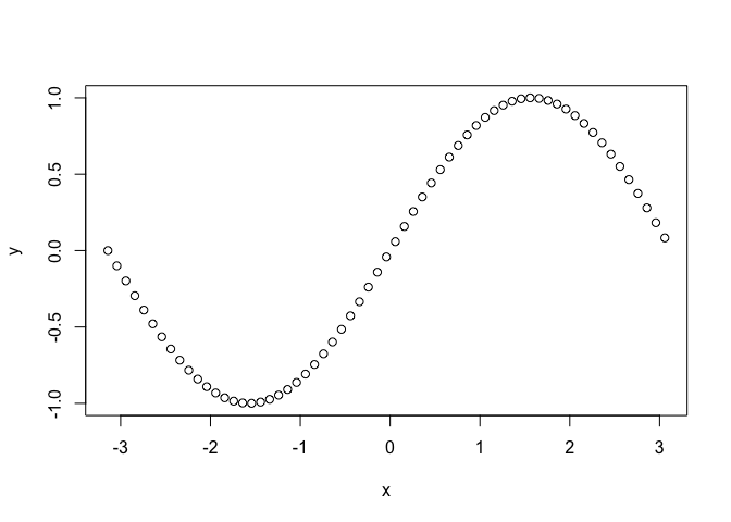
The easiest way to create a plot is to use the plot function. Let’s
begin by considering a plot of the sine function.
x <- seq(-pi, pi, 0.1)
y <- sin(x)
plot(x, y)
Let’s improve this plot with some visual additions.
plot(x, y, main="Sine", xlab = "x", ylab="sin(x)", type="l", col="skyblue")
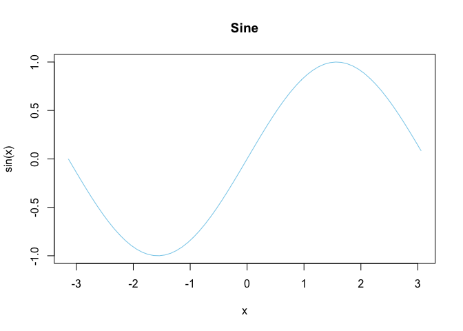
That looks slightly better.
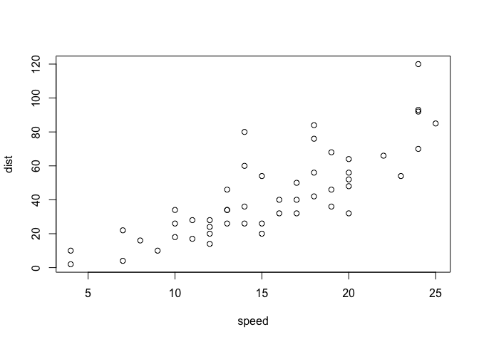
Plotting can also be performed with data frames. cars is a built-in
dataset in R that we will use here for demonstrative purposes.
plot(cars)
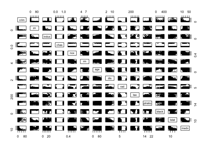
We can also create a pairplot, which shows the distributional relationship between each columns in the table. Intuitively, I understand it as something like a visual analogue of a symmetric matrix, with each cell showing the distribution according to the row and column variables.
pairs(table)
Note that the plot function is versatile. We can specify which columns
to plot, as well as set the labels of the plot to be created. For
example,
with(
  table,
  plot(medv,
       crim,
       main="Crime Rate versus Median House Value",
       xlab="median value of owner-occupied",
       ylab="crime rate")
)
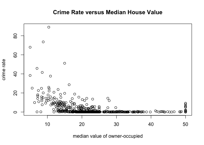
Equivalently, we could have used this command:
plot(crim~medv, data=table, main="Crime Rate versus Median House Value", xlab="median value of owner-occupied", ylab="crime rate")

Apply Functions
lapply
Let’s start with what I think is the easiet one: lapply. In Python
terms, this would be something like np.vectorize. Here is a very quick
demo with a dummy example.
movies <- c("SPYDERMAN","BATMAN","VERTIGO","CHINATOWN")
movies_lower <- unlist(lapply(movies, tolower))
movies_lower

## [1] "spyderman" "batman"    "vertigo"   "chinatown"
The unlist function was used to change the list into a vector. The
gist of lapply is that it receives as input some dataframe, list or
vector, and applies the given function to each element of that iterable.
A similar effect could be achieved with a loop, but the vectorized
nature of lapply makes it a more attractive option.
sapply
sapply does the same thing as unlist(lapply(X, FUN)). In other
words,
movies <- c("SPYDERMAN","BATMAN","VERTIGO","CHINATOWN")
movies_lower <- sapply(movies, tolower)
movies_lower

##   SPYDERMAN      BATMAN     VERTIGO   CHINATOWN
## "spyderman"    "batman"   "vertigo" "chinatown"
Note that we can use sapply to dataframes as well. For instance,
sapply(table, mean)

##         crim           zn        indus         chas          nox
##   3.61352356  11.36363636  11.13677866   0.06916996   0.55469506
##           rm          age          dis          rad          tax
##   6.28463439  68.57490119   3.79504269   9.54940711 408.23715415
##      ptratio        black        lstat         medv
##  18.45553360 356.67403162  12.65306324  22.53280632
In this case, mean is applied to each column in table.
apply
The apply function is a vectorized way of processing tabular data. If
you are familiar with Pandas, you will quickly notice that Pandas
shamelessly borrowed this function from R. Let’s take a look at what
apply can do.
apply(X=cars, MARGIN=2, FUN=mean, na.rm=TRUE)

## speed  dist
## 15.40 42.98
Notice that apply basically ran down the data and computed the mean of
each available numerical column. The na.ra=True is an optional
argument that is passed onto FUN, which is mean. Without this
specification, R will complain that there are missing data in the table
given, if any.
Of course, we can try other functions instead of mean. This time,
let’s try using the quantile function.
apply(table, MARGIN=2, quantile, probs=c(0.25, 0.5, 0.75), na.rm=TRUE)

##         crim   zn indus chas   nox     rm    age      dis rad tax ptratio
## 25% 0.082045  0.0  5.19    0 0.449 5.8855 45.025 2.100175   4 279   17.40
## 50% 0.256510  0.0  9.69    0 0.538 6.2085 77.500 3.207450   5 330   19.05
## 75% 3.677083 12.5 18.10    0 0.624 6.6235 94.075 5.188425  24 666   20.20
##        black  lstat   medv
## 25% 375.3775  6.950 17.025
## 50% 391.4400 11.360 21.200
## 75% 396.2250 16.955 25.000
And with that, we can receive an instant IQR summary of the data for each numerical column in the data.
If you’re thinking that apply is similar to sapply and lapply
we’ve looked so far, you’re not wrong. apply, at least to me, seems to
be a more complex command capable of both row and column-based
vectorization. It is also different in that it can only be applied to
tabular data, not list or vectors (if that were the case, then the
MARGIN argument would be unncessary).
tapply
tapply is slightly tricker than the ones we have seen above, as it is
not just a vectorized operation applied to a single set of data.
Instead, tapply is capable of splitting data up into categories
according to a second axis. Let’s see what this means with an example:
tapply(iris$Sepal.Width, iris$Species, mean)

##     setosa versicolor  virginica
##      3.428      2.770      2.974
As you can see, tapply segments the Sepal.Width column according to
Species, then returns the mean for each segmentation. This is going to
be incredibly useful in identifying hidden patterns in data.
Charts
In this section, we will take a look at how to create charts and visualizations, using only the default loaded library in R.
Bar Plot
Bar plots can be created using–yes, you guessed it–the barplot
command. Let’s remind ourselves that a bar plot is a visualization of
the frequencey for each category or a categorical variable.
barplot(table(iris$Species))
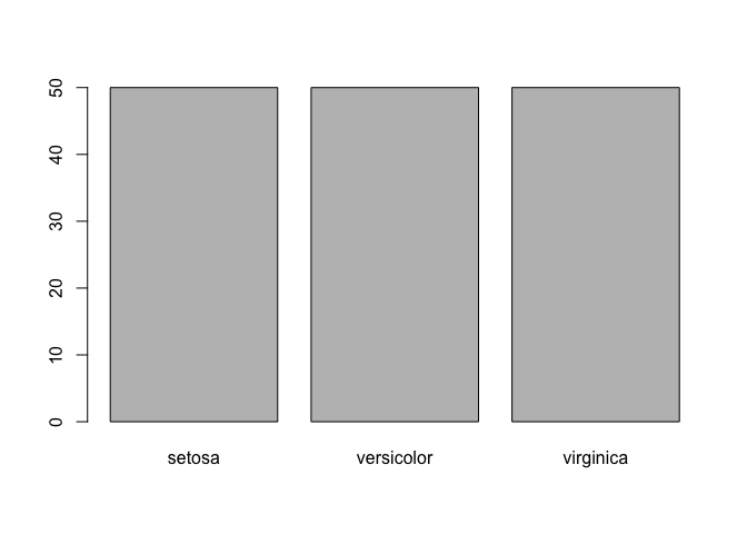
One peculiarity that you might have noticed is that we wrapped the
dataset with table. This is because barplot receives a frequency
table as input. To get an idea of what this frequencey table looks like,
let’s create a relative frequencey table.
freq <- table(iris$Species) / length(iris$Species)
freq

##
##     setosa versicolor  virginica
##  0.3333333  0.3333333  0.3333333
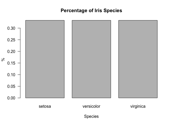
Now let’s try prettifying the bar plot with some small customizations.
Note that the las argument rotates the values on the y-axis.
barplot(freq, main="Percentage of Iris Species", xlab="Species", ylab="%", las=1)
Pie Chart
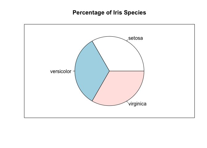
It’s really easy to move from a bar plot to a pie chart, since they are
just different ways of visualizing the same information. In particular,
we can use the pie command.
pie(freq, main="Percentage of Iris Species")
box()
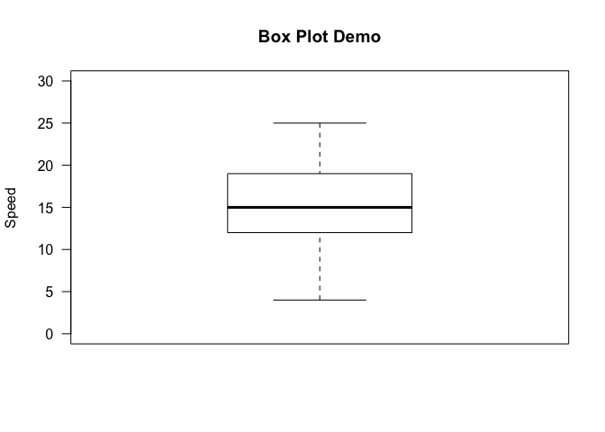
Box Plot
A box plot is a way of visualizing the five number summary, which to
recap consists of the minimum, first, quartile, median, third quartile,
and the maximum of a given dataset. Let’s quickly draw a vanilla box
plot using the boxplot command, with some minimal labeling.
boxplot(cars$speed, main="Box Plot Demo", ylim=c(0, 30), ylab="Speed", las=1)
We can get a bit more sophisticated by segmenting the data by some other
axis, much like we did for tapply. This can be achieved in R by the
~ operator. Concretely,
boxplot(iris$Sepal.Length~iris$Species, xlab="Species", ylab="Sepal Length", main="Sepal Length by Iris Species", las=1)
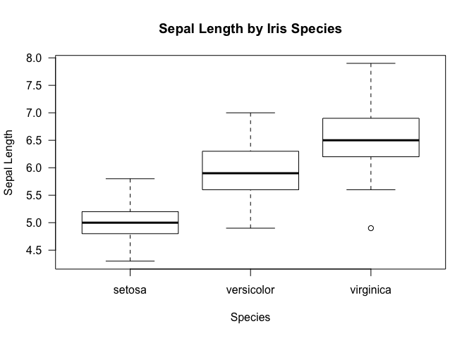
Just as a reminder, this is what we get with a tapply function. Notice
that the results shown by the box plot is more inclusive in that it also
provides information on the IQR aside from just the mean.
tapply(iris$Sepal.Length, iris$Species, mean)

##     setosa versicolor  virginica
##      5.006      5.936      6.588
Histogram
Creating histograms is not so much different form the other types of
visualizations we have seen so far. To create a histogram, we can use
the hist command.
hist(table$medv, freq=FALSE, ylim=c(0, 0.07), main='Median Value of Housing Prices', xlab='Median Value', las=1)
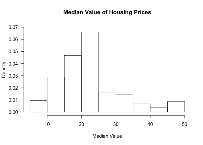
The freq argument clarifies whether we want proportions as fractions
or the raw count.
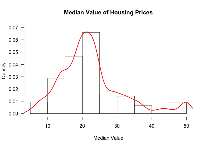
We can also add a density curve over the histogram to get an approximation of the distribution of the data.
hist(table$medv, freq=FALSE, ylim=c(0, 0.07), main='Median Value of Housing Prices', xlab='Median Value', las=1)
lines(density(table$medv), col=2, lwd=2)
Scatter Plot
Scatter plots can be created in R via the plot command.
Let’s check if there exists a linear relationship between the variables
of interest in the car dataframe.
cor(cars$speed, cars$dist)

## [1] 0.8068949
Pearson’s correlation suggests that there does appear to be a linear relationship. Let’s verify that this is indeed the case by creating a scatter plot.
plot(cars$speed, cars$dist, xlab='Speed', ylab='Dist', main='Speed vs Dist', las=1)
lines(smooth.spline(cars$speed, cars$dist))
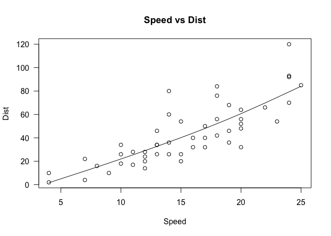
Note that we have already seen this graph previously, when we were discussing the basics of graphing in an earlier section. Several modifications have been made to that graph, namely specifying the variables that go into the x and y axis, as well as some labeling and titling. We’ve also added a spline, which can be considered a form of regression line that explains the pattern in the data.
Conclusion
This tutorial got very long, but hopefully it gave you a review (or a preview) of what the R programming language is like and what you can do with it. As it is mainly a statistical computing language, it is geared towards many aspects of data science, and it is no coincidence that R is one of the most widely used language in this field, coming second after Python.
In the upcoming R tutorials, we will take a look at some other commands that might be useful for data analysis. Stay tuned for more!