Experimenting with Jupyter Notebook
So far on this blog, all posts were written using Markdown. Markdown is very easy and learnable even for novices like me, but an issue I had was the inconvenience of integrating texts, code, and figures organically in one coherent file. That is why I decided to experiment with Jupyter Notebook, which I had meant to use and learn for a very long time.
In this post, we will test the functionality of Jupyter Notebook by trying out various visualization tools available in Python. In the next post, I will introduce the method I utilized toconvert this .ipynb file into .md format to display it on our static website.
# A classic opener
print("Hello world")
Hello world
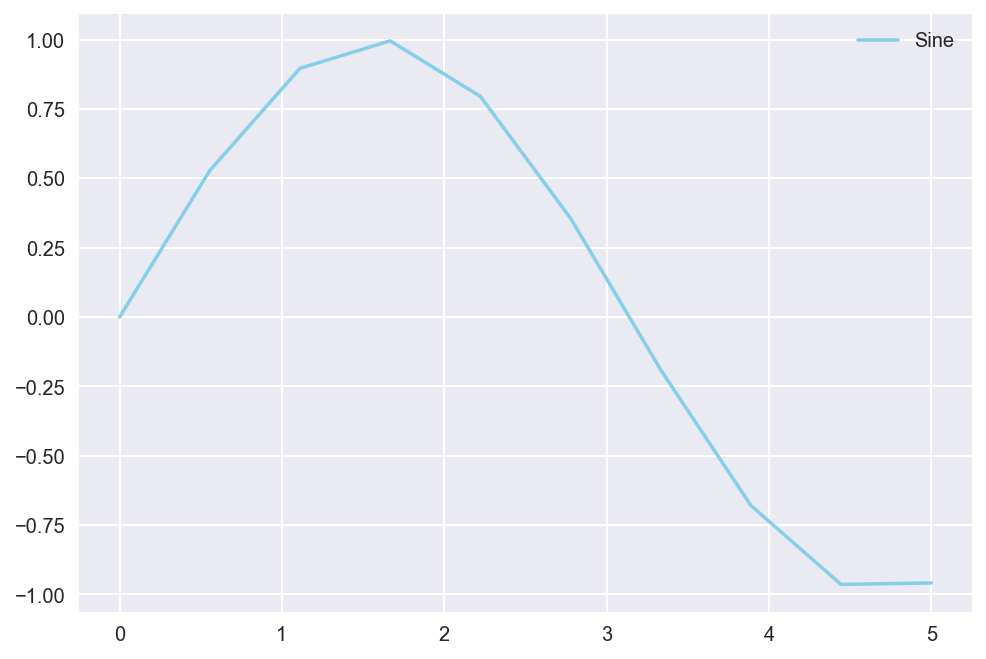
We can also use libraries to create visualizations. Shown below is a simple representation of a sine graph created using numpy and matplotlib.
import numpy as np
import matplotlib.pyplot as plt
%matplotlib inline
%config InlineBackend.figure_format = 'retina'

x = np.linspace(0, 5, 10)
y = np.sin(x)
plt.style.use("seaborn")
plt.plot(x, y, color="skyblue", label="Sine")
plt.legend()
plt.show()
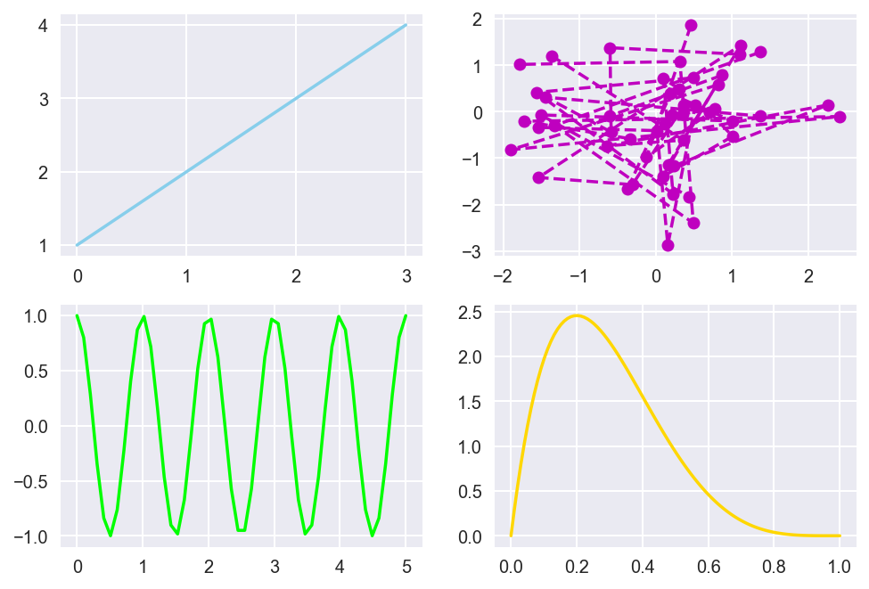
Let’s step up the game a bit. Here is a simple experimentation with subplots with the matplotlib package again.
from scipy.stats import beta

fig, ax = plt.subplots(2, 2)

ax[0][0].plot([1,2,3,4], color="skyblue")
ax[0][1].plot(np.random.randn(5, 10), np.random.randn(5,10), "mo--")
ax[1][0].plot(np.linspace(0, 5), np.cos(2 * np.pi * np.linspace(0, 5)), color="lime")
ax[1][1].plot(np.linspace(0, 1, 100), beta.pdf(np.linspace(0, 1, 100), 2, 5), color="gold")

plt.show()
Next, we use pandas to see if basic spreadsheet functionalities can be displayed on Jupyter.
import pandas as pd

df = pd.DataFrame(np.random.randn(5, 5))

print(df.head())
          0         1         2         3         4
0 -0.119558 -0.632469 -2.176383 -0.310280 -0.480731
1  0.285325  0.184601  0.808425  0.191247 -0.562904
2 -0.305665  2.057085  0.191773  0.217347  0.713348
3 -0.608312 -0.028068  0.222626  0.760257 -1.193710
4  0.627122 -1.325584  0.504316 -0.079908 -0.051234
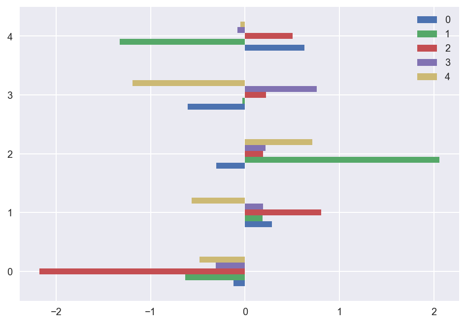
We can visualize this toy data using the pandas.plot function, much like we created visualizations with matplotlib above.
df.plot(kind='barh')
<matplotlib.axes._subplots.AxesSubplot at 0x1a1ceabdd0>
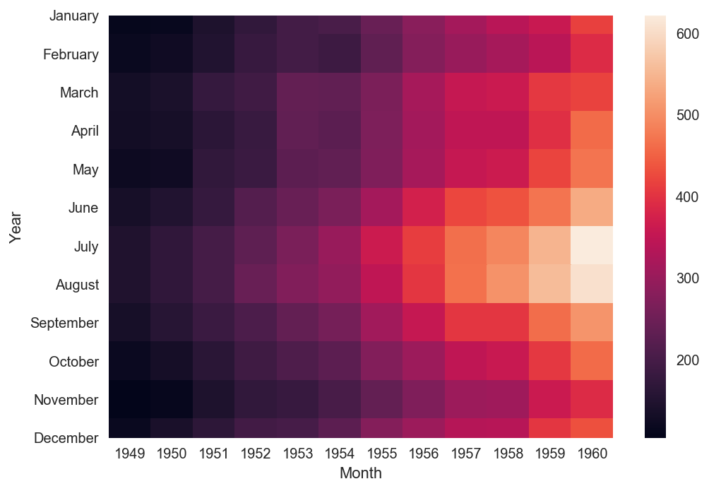
seaborn is another powerful data visualization framework. It is based off of matplotlib, but seaborn also contains graphing functionalities that its parent does not, such as heatmaps.
import seaborn as sns

flights = sns.load_dataset("flights")
flights = flights.pivot("month", "year", "passengers")
ax = sns.heatmap(flights, annot=False, fmt="d")
plt.xlabel("Month")
plt.ylabel("Year")
plt.show()
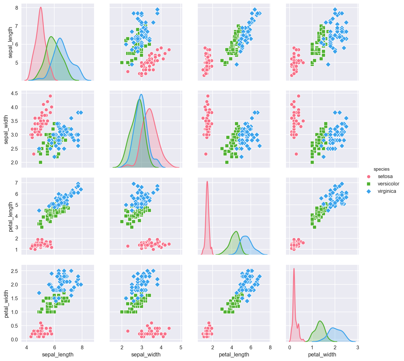
Pair plots are used to visualize multidimensional data. We can see pair plots in action by using the seaborn.pairplot function. Below are visualizations created using one of seaborn’s default data set.
iris = sns.load_dataset("iris")
sns.pairplot(iris, hue="species", markers=["o", "s", "D"], palette="husl")
plt.show()
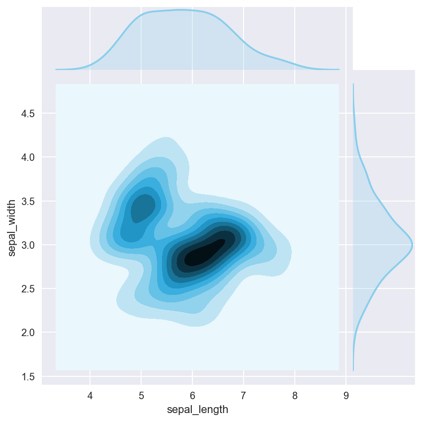
seaborn also contains a joint plot graphing functionality that allows us to group multiple graphs into one compact figure, as demonstrated below.
sns.jointplot(x="sepal_length", y="sepal_width", data=iris, kind="kde", space=0, color="skyblue")
plt.show()
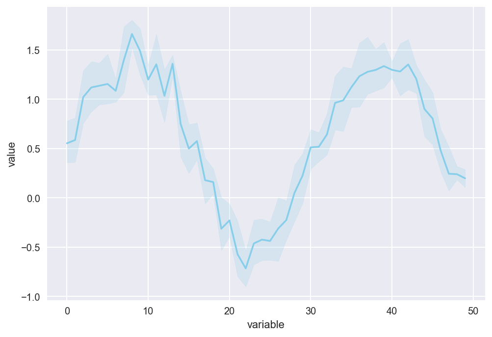
The last example we will take a look at is the lineplot in seaborn. lineplots are used when there is a lot of noise in the data.
x = np.linspace(0, 10, 50)
data = np.sin(x) + np.random.rand(5, 50)
df = pd.DataFrame(data).melt()
sns.lineplot(x="variable", y="value", data=df, color="skyblue")
plt.show()
This is a quick check to see if equations can properly be displayed on Jupyter using Mathjax.
\[\begin{equation*} P(E) = {n \choose k} p^k (1-p)^{ n-k} \end{equation*}\]Here is the cross product formula (which I barely recall from MATH 120).
\[\begin{equation*} \mathbf{V}_1 \times \mathbf{V}_2 = \begin{vmatrix} \mathbf{i} & \mathbf{j} & \mathbf{k} \\ \frac{\partial X}{\partial u} & \frac{\partial Y}{\partial u} & 0 \\ \frac{\partial X}{\partial v} & \frac{\partial Y}{\partial v} & 0 \end{vmatrix} \end{equation*}\]This is enough Jupyter for today! Once I fully familiarize myself with Jupyter, perhaps I will write more posts using this platform.