R Tutorial (3)
A few days ago, I saw a friend who posted an Instagram story looking for partners to study R with. I jumped at the opportunity without hesitation—based on my experience these past six months, I knew all too well that studying alone is a lonely, difficult process. The hardest part about it is keeping oneself accountable and continuing a long streak without losing momentum. So I said that I’d love to join him and his crew.
What we do as a group is nothing grandiose: we simply keep a log of what we’re studying and answer questions that others might have when they come up in our group chat. While the studying is mostly done on one’s own, the fact that we keep a semi-public record of where we are in terms of our study should hopefully motivate all of us to keep making progress until the end. As for me, my goal is to finish the book R for Data Science, which I had meant to read but never went past chapter 1, mostly because I got carried away by other things.
Enough of the prologue, here’s a summary of what I’ve learned so far by from the book.
Introduction
ggplot2 is a powerful visualization package in R, much like matplotlib in Python. I’m not proficient enough in ggplot2 to make a direct comparison, but I’ve heard very positive things about EDA with R, so I’m excited to learn and have an additional tool under my belt.
Setup
Let’s first load the tidyverse library to get started.
library(tidyverse)

## ── Attaching packages ────────────────────────────────────────────────────────── tidyverse 1.3.0 ──

## ✔ ggplot2 3.2.1     ✔ purrr   0.3.3
## ✔ tibble  2.1.3     ✔ dplyr   0.8.3
## ✔ tidyr   1.0.0     ✔ stringr 1.4.0
## ✔ readr   1.3.1     ✔ forcats 0.4.0

## ── Conflicts ───────────────────────────────────────────────────────────── tidyverse_conflicts() ──
## ✖ dplyr::filter() masks stats::filter()
## ✖ dplyr::lag()    masks stats::lag()
Dataset
We will be dealing with the mpg data frame, which is built into ggplot2. Since we’ve already loaded ggplot2 via tidyverse, we can take a look at the data frame simply by typing its name.
head(mpg)

## # A tibble: 6 x 11
##   manufacturer model displ  year   cyl trans  drv     cty   hwy fl    class
##   <chr>        <chr> <dbl> <int> <int> <chr>  <chr> <int> <int> <chr> <chr>
## 1 audi         a4      1.8  1999     4 auto(… f        18    29 p     comp…
## 2 audi         a4      1.8  1999     4 manua… f        21    29 p     comp…
## 3 audi         a4      2    2008     4 manua… f        20    31 p     comp…
## 4 audi         a4      2    2008     4 auto(… f        21    30 p     comp…
## 5 audi         a4      2.8  1999     6 auto(… f        16    26 p     comp…
## 6 audi         a4      2.8  1999     6 manua… f        18    26 p     comp…
We will also be using the diamonds data set, also from ggplot2. Let’s take a look.
head(diamonds)

## # A tibble: 6 x 10
##   carat cut       color clarity depth table price     x     y     z
##   <dbl> <ord>     <ord> <ord>   <dbl> <dbl> <int> <dbl> <dbl> <dbl>
## 1 0.23  Ideal     E     SI2      61.5    55   326  3.95  3.98  2.43
## 2 0.21  Premium   E     SI1      59.8    61   326  3.89  3.84  2.31
## 3 0.23  Good      E     VS1      56.9    65   327  4.05  4.07  2.31
## 4 0.290 Premium   I     VS2      62.4    58   334  4.2   4.23  2.63
## 5 0.31  Good      J     SI2      63.3    58   335  4.34  4.35  2.75
## 6 0.24  Very Good J     VVS2     62.8    57   336  3.94  3.96  2.48
Basic Syntax
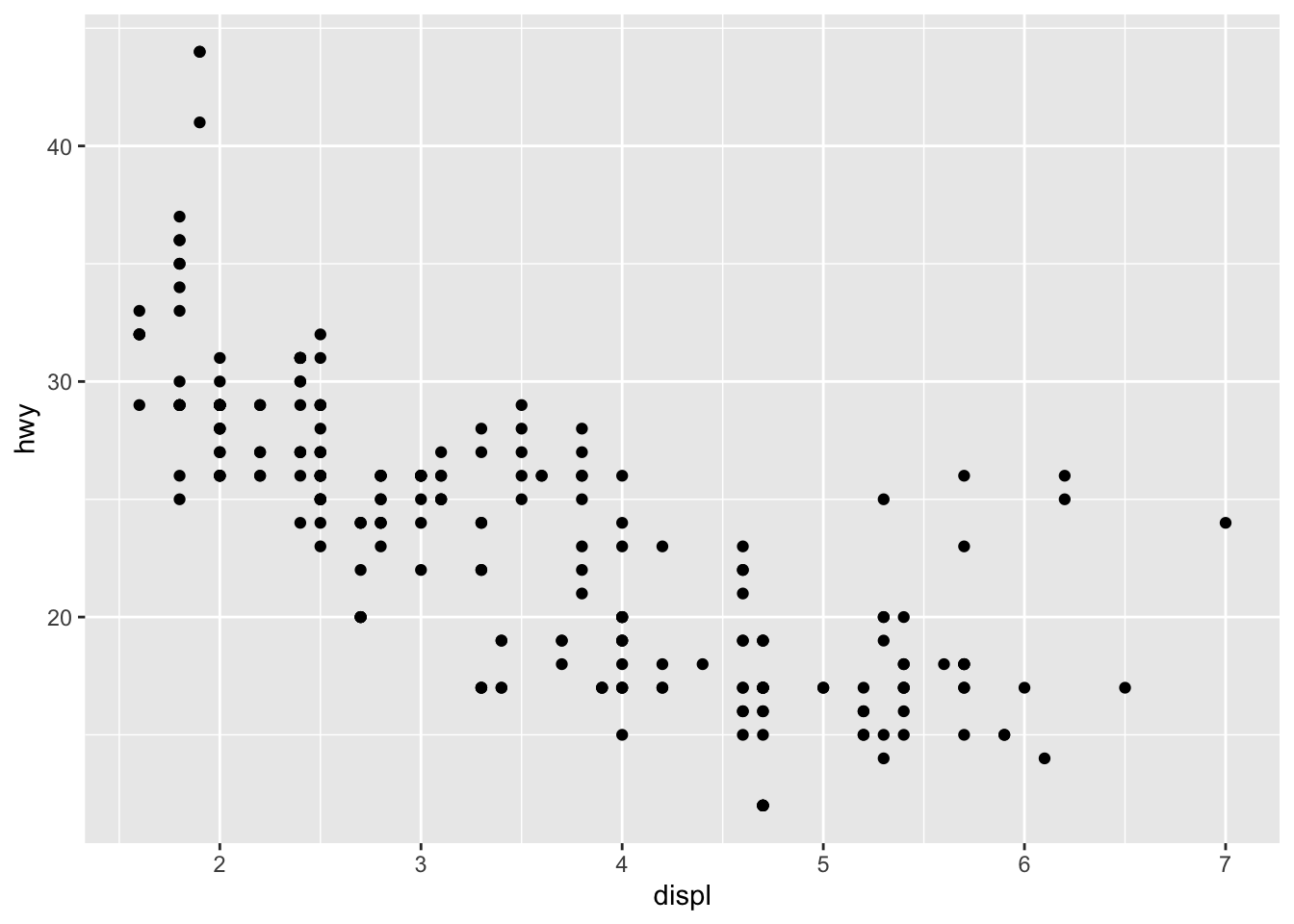
Let’s cut to the chase and take a look at a very simple example of a ggplot.
ggplot(data = mpg) +
  geom_point(mapping = aes(x = displ, y = hwy))
Things might look a bit confusing at first, but here is a brief rundown of the syntax:
ggplot(data = <DATA>) +
  <GEOM_FUNCTION>(mapping = aes(<MAPPINGS>))
The obvious part is the declaration of data that we do inside the ggplot function. Here, we simplify specify what data frame we are going to be using. Then, we add <GEOM_FUNCTION>s to the canvas. This is somewhat akin to calling ax.plot and ax.scatter in Python, where <GEOM_FUNCTION> is like plot, scatter, bar, or other variations,
The mapping = aes(<MAPPINGS>) is in a sense a set structure in R. As the name implies, mapping maps various visualization attributes to the data. These attributes include basic things like x and y, as well as other aspects like color, alpha, or shape. For example, we might do something like
ggplot(data = mpg) +
  geom_point(mapping = aes(x = displ, y = hwy, shape = class))

## Warning: The shape palette can deal with a maximum of 6 discrete values
## because more than 6 becomes difficult to discriminate; you have 7.
## Consider specifying shapes manually if you must have them.

## Warning: Removed 62 rows containing missing values (geom_point).
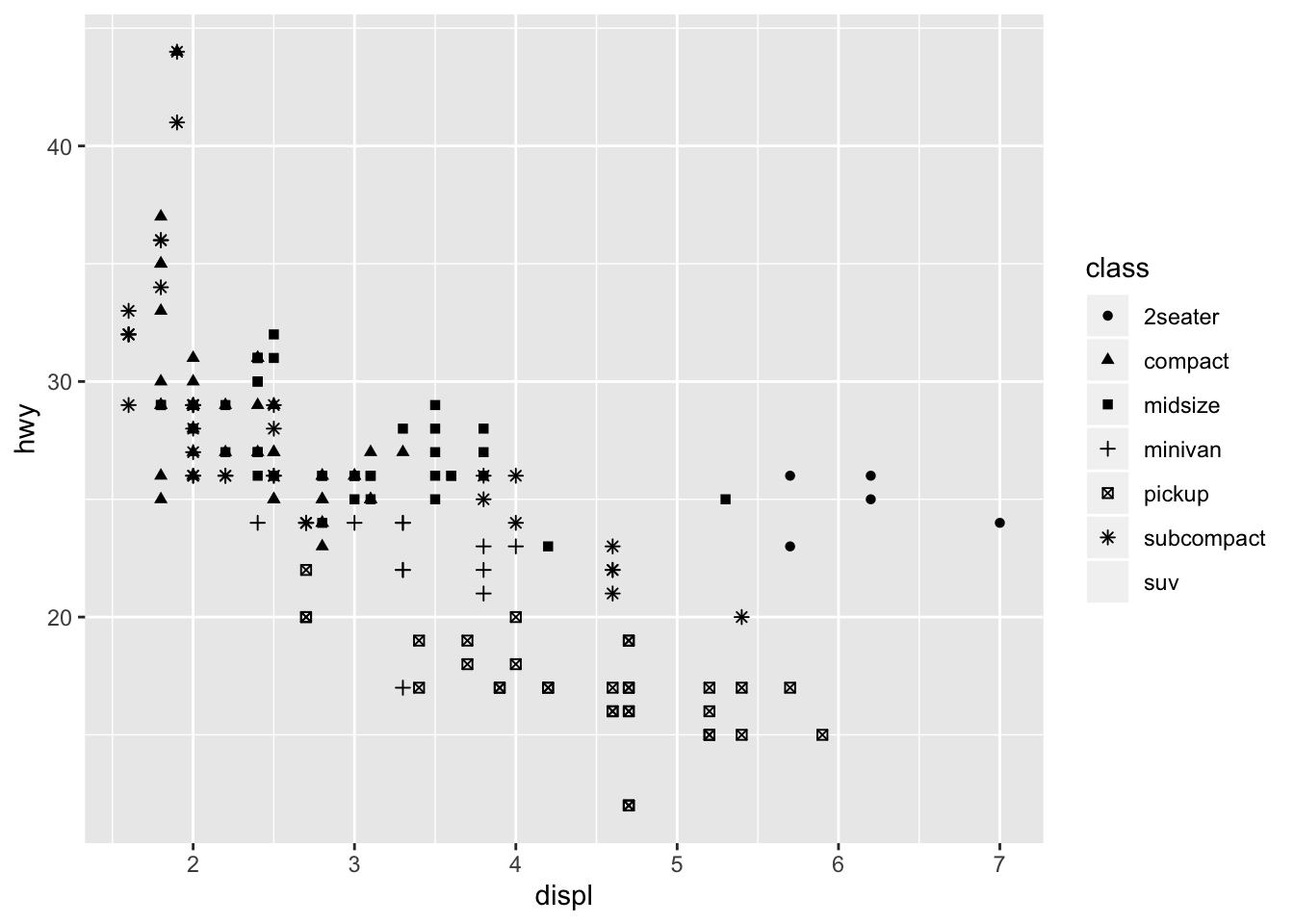
In this case, the problem is that R only supports 6 different ticks or shapes by default, but we have 7 classes, making it impossible to render every data point. Nonetheless, it demonstrates how we can toggle additional options within mapping and aes.
Scoping
We can also make use of scoping to reduce redundanceis. For example, consider the following graph declaration.
ggplot(data = mpg) +
  geom_point(mapping = aes(x = displ, y = hwy)) +
  geom_smooth(mapping = aes(x = displ, y = hwy))

## `geom_smooth()` using method = 'loess' and formula 'y ~ x'
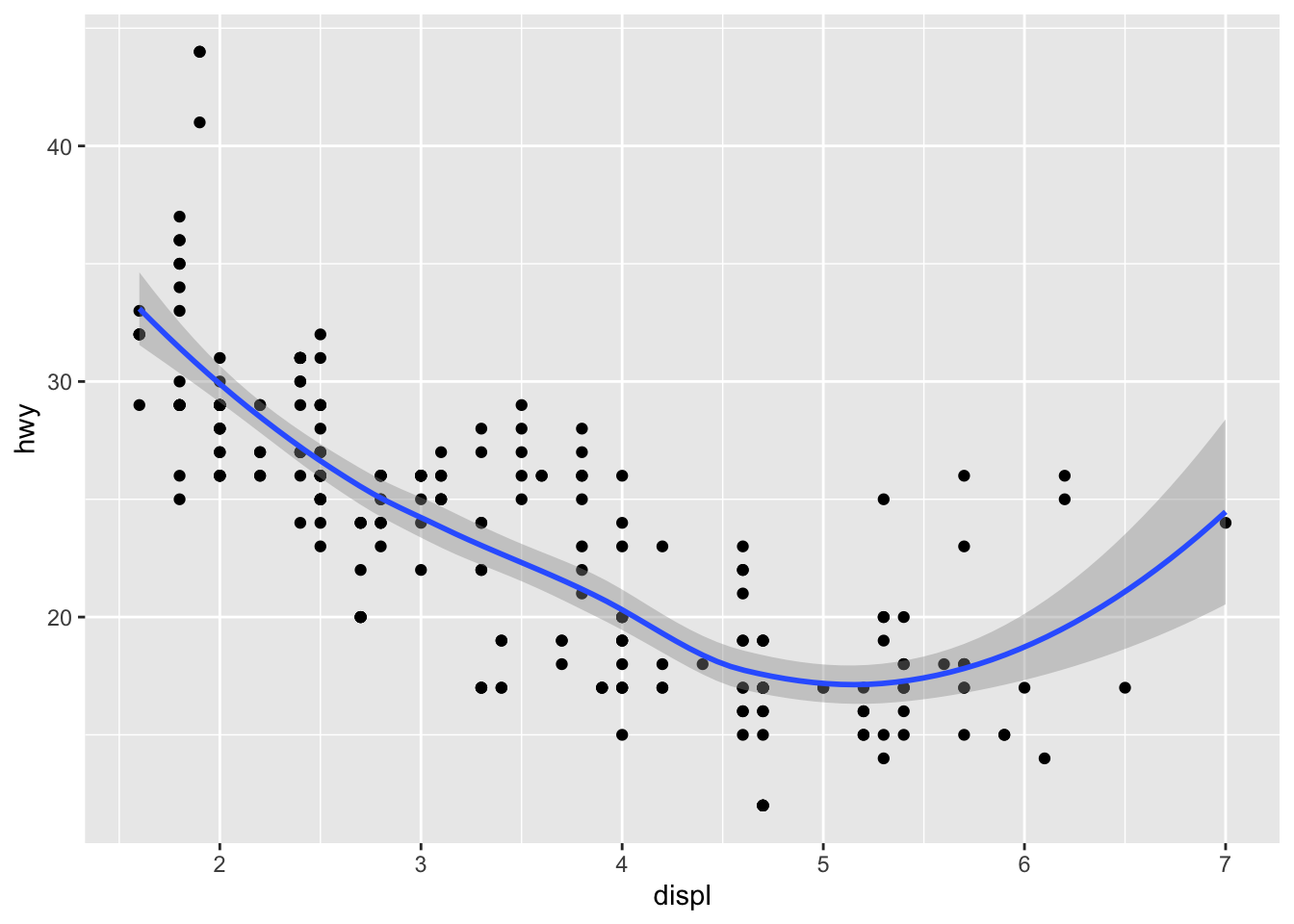
This is cool, but notice that we are writing repated code for the mappings. Instead, we can use global scoping under the ggplot function and streamline the code as follows:
ggplot(data = mpg, mapping = aes(x = displ, y = hwy)) +
  geom_point() +
  geom_smooth()

## `geom_smooth()` using method = 'loess' and formula 'y ~ x'

This is no rocket science: all that happened is that we moved the mapping arguments upward to ggplot, so that we no longer have to specify the mapping for each GEOM_FUNCTION as we had done previously. This not only helps save time, but is also easier to maintain and read.
Facets
We can also create subplots that separate out each plot for an axis or dimension of data. This can sound a bit abstract at first, and indeed I did have some trouble understanding what faceting meant when I first read the relevant portion, but it’s surprisingly simple. The executive summary is that facets can be considered as a row of plots extracted from a pair plot. Enough talking, let’s take a look.
ggplot(data = mpg) +
  geom_point(mapping = aes(x = displ, y = hwy)) +
  facet_wrap(~ class)
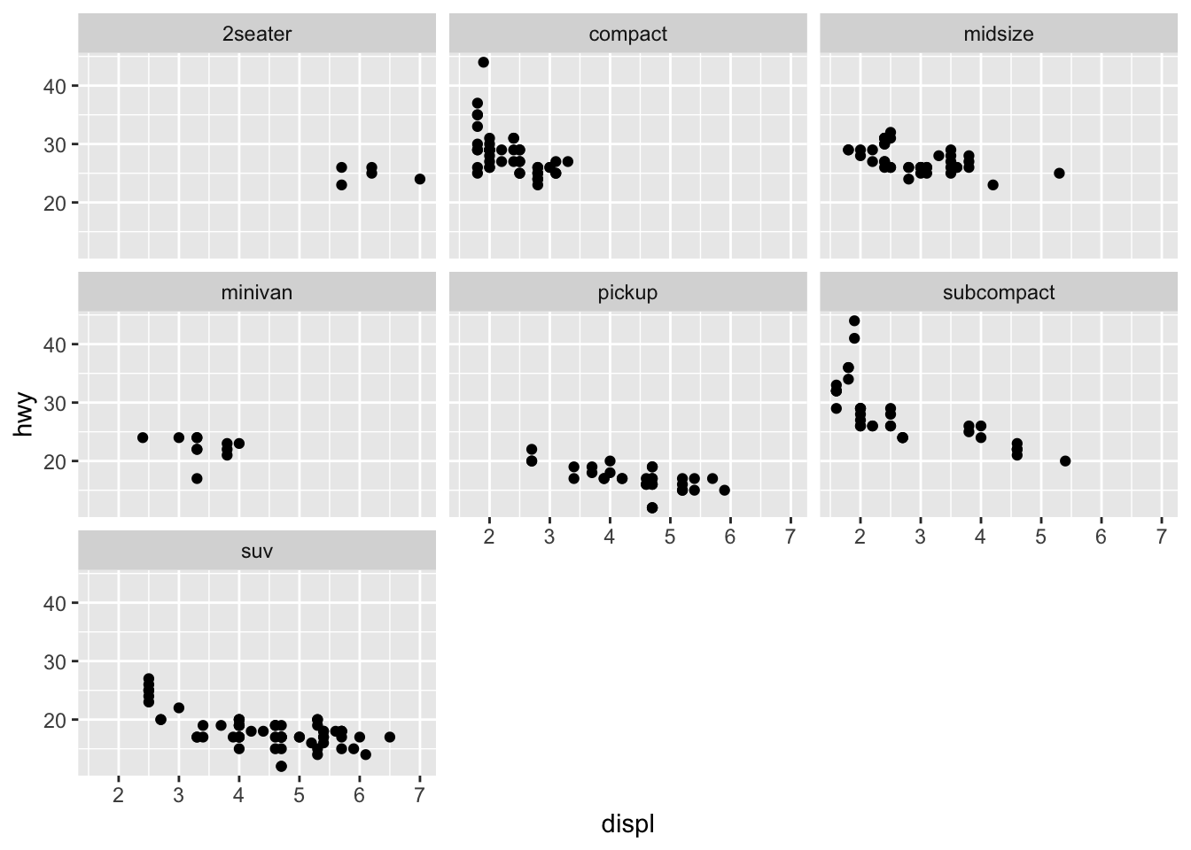
As you can see, instead of having all data points in one graph, facetting allows us to divide up the data according to some axis, such as ~ class in this case. This might help us discover hidden trends that are not as obvious if the data were to be viewed in aggregate.
We can also facet according to multiple axes instead of just one. The syntax is not so different from the previous example. The biggest difference is that instead of using facet_wrap, we use facet_grid.
ggplot(data = mpg) +
  geom_point(mapping = aes(x = displ, y = hwy)) +
  facet_grid(drv ~ cyl)
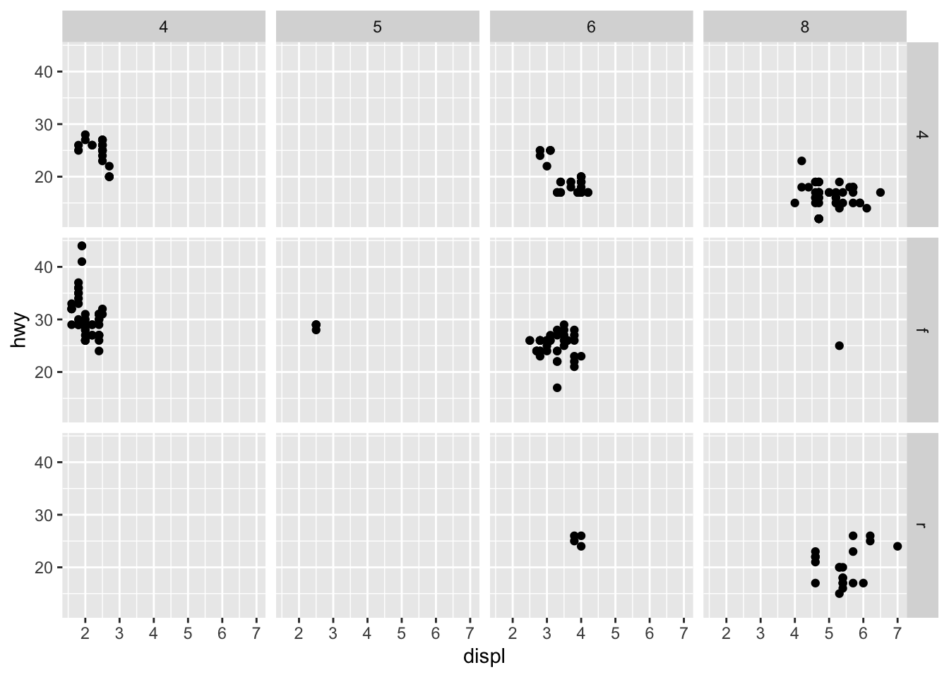
Here, we see the distribution of hwy according to two axes, drv and cyl. Intuiting these facet graphs can get a bit more difficult as we start faceting around multiple axes, but simply think of it this way: instead of considering the data as a whole, we segment the data into certain groups according to their respective axeses or categories.
Colors
Fanciness is definitely not what defines a good visualization, but some degree of vibrance certainly helps portray information, if used correctly. Let’s experiment with some colors.
ggplot(data = diamonds) +
  geom_bar(mapping = aes(x = cut, fill = cut))
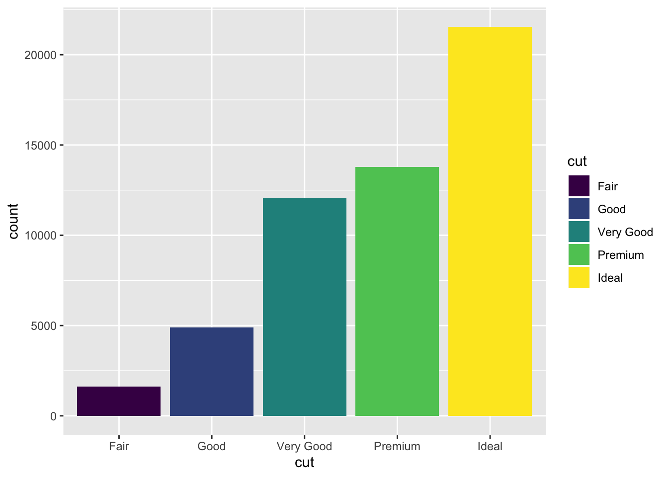
By specifying fill, we see that, as expected, the fill of each bar in the bar plot have been painted according to cut. This is good, but it doesn’t exactly add new information. We can perhaps get a bit more creative and add an additional dimension of information by specifying fill to be something other than cut, which is already handled by
x. For instance,
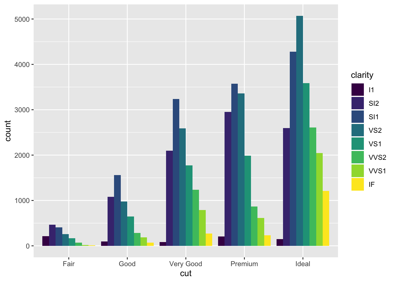
ggplot(data = diamonds) +
  geom_bar(mapping = aes(x = cut, fill = clarity))
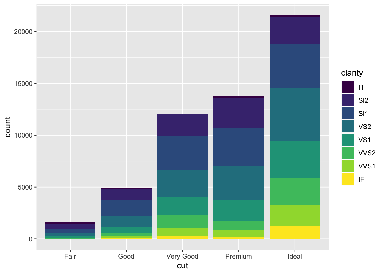
Now things look a bit more interesting. Here, we not only see information on count, but we also see the composition or distribution of clarity level for each count. This has certainly added a layer of information.
Position
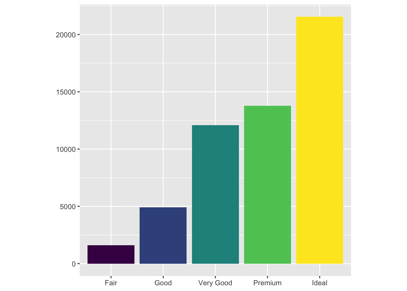
We can also specify a positional arguments to modify the looks of the graph a bit further according to our tastes and needs. For example,position = "fill" makes the graphs such that it will fill the canvas.
ggplot(data = diamonds) +
  geom_bar(mapping = aes(x = cut, fill = clarity), position = "fill")
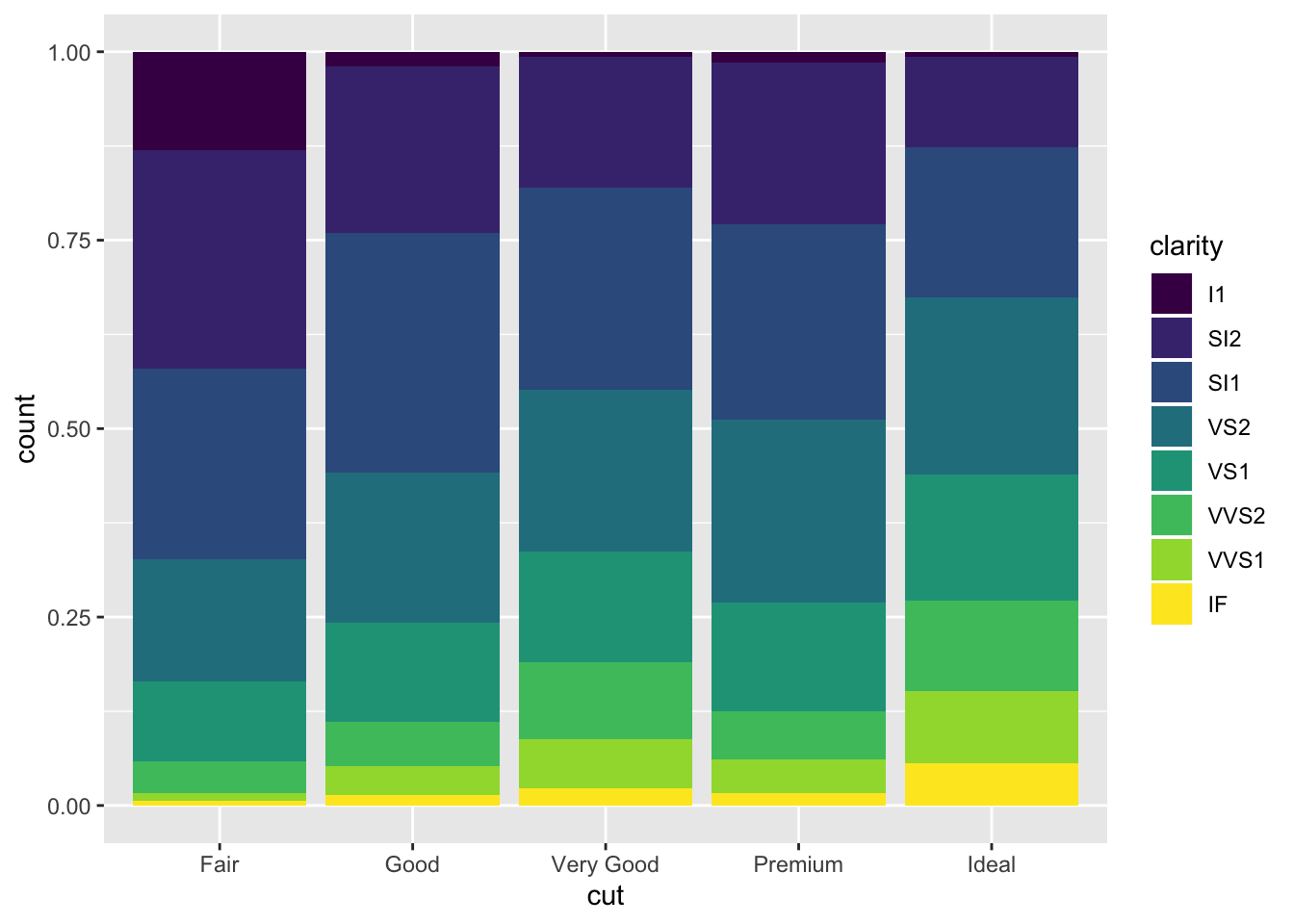
This information is informative in that it tells us that the higher the clarity of a dimaon, the more likely it is to be in a certain grade of cut. Namely, the yellow IF clarity diamonds seems to belong to ideal the most.
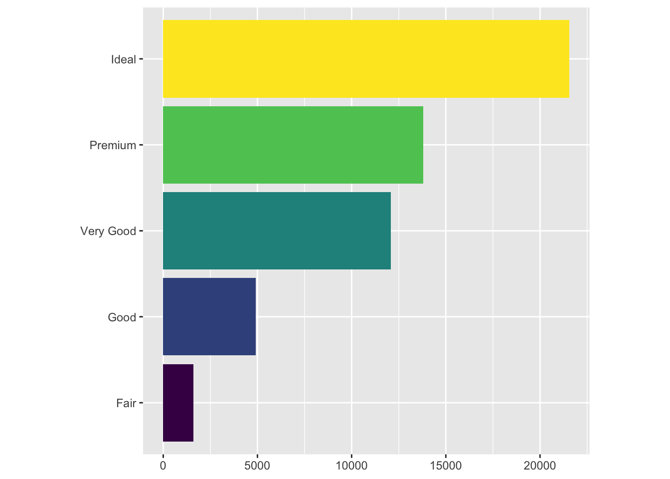
ggplot(data = diamonds) + geom_bar(
            mapping = aes(x = cut, fill = clarity),
            position = "dodge"
          )
There are other interesting options as well. For example, position = "doge" places overlapping objects next to each other. Some other interesting options for scatter plots include "jitter". For the purposes of this notebook, however, we won’t go over every option there is: it suffices to demonstrate the role and functionality of the position argument in R.
Coordinates
The default coordinate system for ggplot2 is, as is the case with many other visualization packages, a cartesian coordinate. However, we can often apply transformations to alter the coordinate system. For example, consider the following bar plot:
bar <- ggplot(data = diamonds) +
  geom_bar(
    mapping = aes(x = cut, fill = cut),
    show.legend = F,
  ) +
  theme(aspect.ratio = 1) +
  labs(x = NULL, y = NULL)

bar
We applied some miscellaneous touches to the configuration of the graph, but the gist of it is what we have already seen: a bar plot with coloring.
How can we make this graph more interesting? One way is to apply various transformations to the coordinates of the graph. For instance, let’s try flipping the axes:
bar + coord_flip()
Here, we used the coord_flip function to literally flip the coordinates of the graph. This transformation can become particularly useful when the text labels of the data we are dealing with get very long.
We can also transform the bar chart into a pie chart by moving to a polar coordinate from the cartesian.
bar + coord_polar()
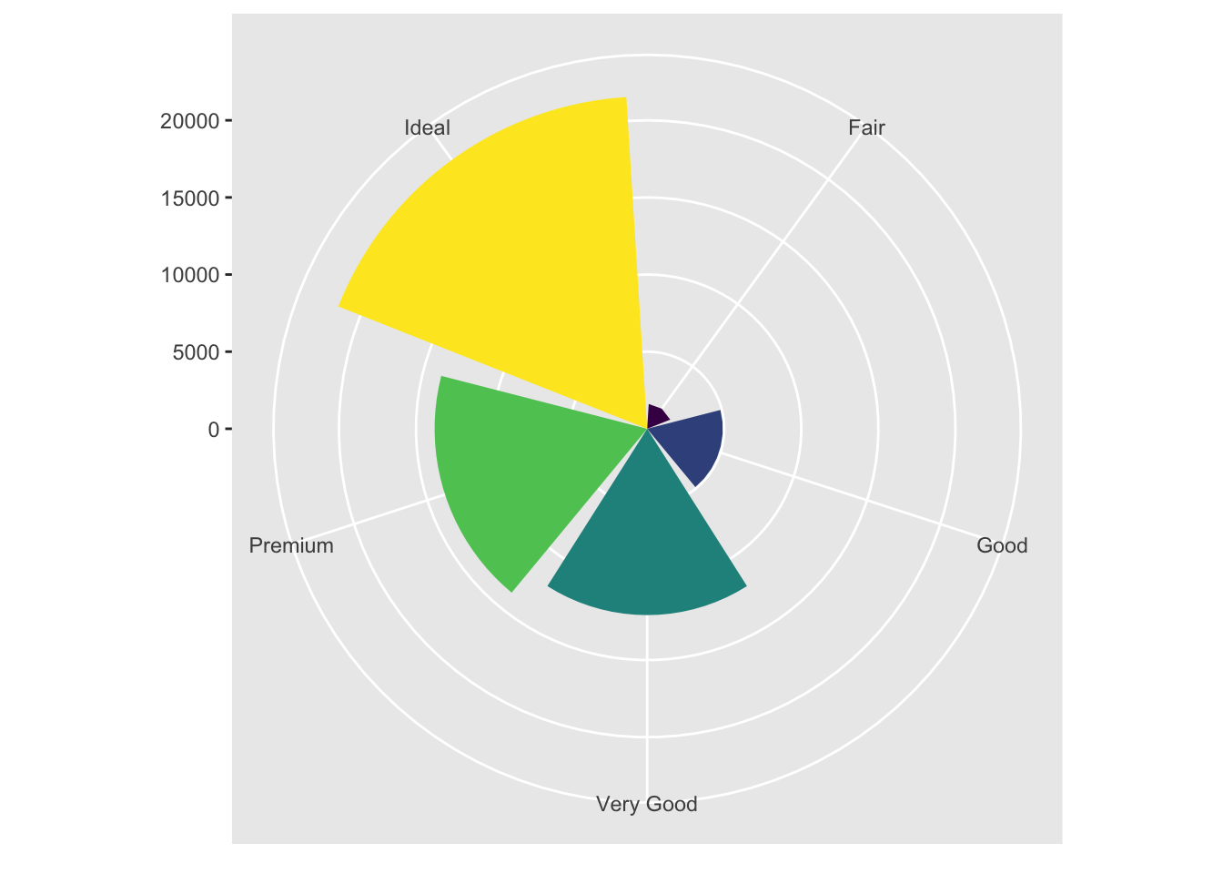
I personally find this visualization incredibly appealing. Just a comment in passing.
Visualization Syntax
In this section, we’ve looked at various ways of creating visualizations and graphs. Using this accumulated knowledge, we can now update the basic syntax of ggplot2 we’ve discussed in the previous section. Recall our basic template:
ggplot(data = <DATA>) +
  <GEOM_FUNCTION>(mapping = aes(<MAPPINGS>))
We can now add more bells and whistles to this formula:
ggplot(data = <DATA>) +
  <GEOM_FUNCTION>(
         mapping = aes(<MAPPINGS>),
         stat = <STAT>,
         position = <POSITION>
) +
  <COORDINATE_FUNCTION> +
  <FACET_FUNCTION>
This contains a lot of information that we have dealt with so far, with the exception of the <STAT> portion, which was dealt in the book but not in this notebook. I decided to leave that portion out because it appears to be a more intricate system that I might be interested as an intermediate user of ggplot2. As of now, the default statistical transformations configured for each <GEOM_FUNCTION> should suffice for most use cases.
Conclusion
ggplot2 is a powerful visualization library with many useful functions. Although R’s vanilla plotting functions such as barplot or hist, which we explored in this previous
post are useful in their own right, ggplot2 offers more customizability and a wealth of functions that make it much more attractive for production.
I hope to continue this series as I get through R for Data Science with my study buddies. I’ve realized that studying new programming languages, such as C and R, during quarantine period is a good way to stay motivated and productive during what could potentially be dull, grey hours.
See you in the next post!