Live Corona Map is a COVID-19 data visuaization and dashboard project I joined in the April of 2020 as a Python developer.
When reported cases of COVID-19 in Korea started to erupt in late Febuary and early March, there existed no centrailzed platform that provided up-to-date, reliable information to the general public. As a matter of fact, even government entities were poorly equipped to flexibly respond to the pandemic. Live Corona Map was created at this critical point in time to provide a trustworthy channel of data to reduce misinformation and the asymmetry of information. It was also used by government agencies—most notably the Jeju Self-governing Provincial Government—to monitor the status quo. Even today, the link redirecting users to Live Corona Map is available on the website of the Jeju Provincial Government.
Given the public nature of Live Corona Map, perhaps it is unsurprising that te code base for this project is entirely open-source. Until recently, the web server for the website was sponsored by Naver. It is also worth mentioning that the project is run entirely by volunteers and civic hackers who commit their time without any form of renumeration.
When I joined the team in April, the project was at a transition phase: reported cases were somewhat starting to drop, as was the volume of user traffic to the website. However, the number of COVID-19 cases started to spike up again in May and June, making it necessary to maintain and improve the web application.
Summarized below is a list of my contributions as a Python developer, which would not have been possible without the support and help of my team members.
The bulk of my work revolved around writing and debugging Python web crawlers. Although there were scripts for different web crawlers, a lot of them were either missing or broken. When I joined the team, people were hand-scraping data from websites instead of relying on automation, saying that web crawlers were highly unreliable.
Using bs4, pandas, and other libraries, I rewrote and engineered 8 web crawlers to make them fully functional and more robust. We were then able to use GitHub Actions CI to schedule automatic web scraping. This vastly improved the reliability and timeliness of the data and graphics posted on the website.
Instead of the more conventional SQL-flavored database, the website directly saves web craped data as .js files, hosted directly on GitHub. The reason behind this seemingly atypical choice is that we want to share the data with other groups and developers—after all, this is the very spirit of open-source.
The issue I saw was that a lot of the code was repeated. For instance, all Python crawler scripts basically used the same routine to create a bs4.BeautifulSoup object using requests. The same logic was also used for other operations, most notably encoding Python dictionaries as JSON files for use later on the client-side.
I created a utils.py file to reduce unnecessary boilerplate and performed some micro-optimizations to streamline the codebase. This vastly improved code readability across the Python portion of the repository.
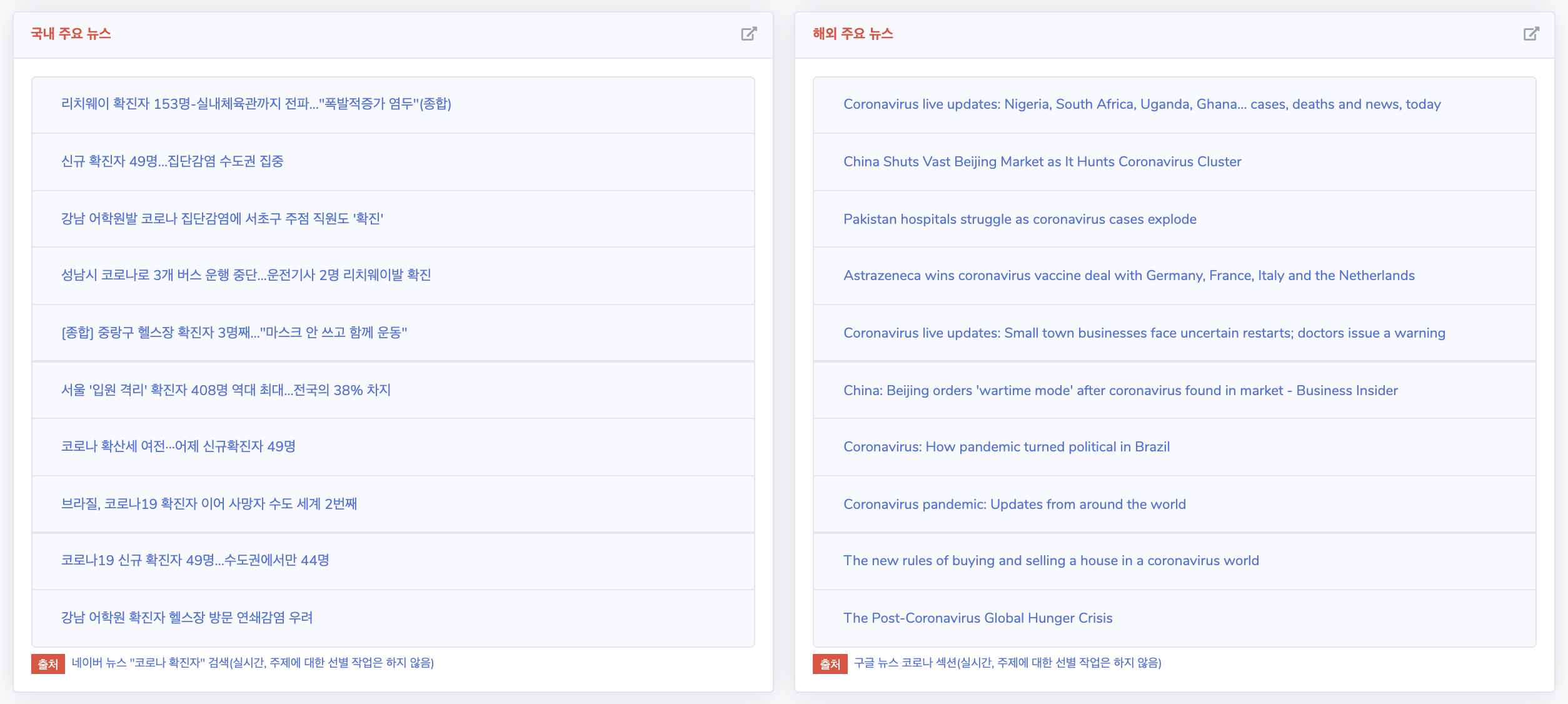
A new feature I added to the website was the “Major Headlines” widget. Previously, the website only displayed numerical, qualitative data. However, I thought it would be informative and helpful to dispay the hottest news headlines regarding COVID-19 so that interested users could be redirected to media websites.
Adding this functionality required use of not only Python for scraping and saving data, but also Javascript for rendering it on the website. It was a challenging, yet also an incrediby rewarding experience.
I added a graph to the website that displays per-day increases in reported cases of COVID-19. This was not an entirely new graph; however, the graph was somewhat ineffective in presenting information since the x-axis was fixed to start from Febuary 10th. Due to the huge spikes in March—at one point, the estimate is over 400 on a single day—more recent cases of 40 to 50 patients on the daily were completely overshadowed in the visualization.
Using simple Javascript and chart.js, a team member and I added a new visualization that displays displays this information for only the last 10 days. I also plan on adding an exponential moving average estimate to smoothen out the graphs we already have.
You can visit the GitHub repository for the website through this link. Feel free to submit a pull request if you find any bugs if there are improvements you want to make yourself!